HVAC Quote Redesign
Project: New HVAC Quote Redesign (Phase 1)
Role: Lead UX Designer
Product Area: Customer Facing
Device Design: Mobile and desktop
Timeframe: Launched in March 2025
Outside of Case Study Scope: Additionally lead the redesign of the contractor HVAC Quote creation work
Outcome: Played a key role in New HVAC surpassing its 2025 revenue targets and enhancing quote-to-sale conversion through a refined and modernized digital experience

Outcome
This work supported the rapid growth of the New HVAC business:
-
Post Launch Revenue: New HVAC exceeded its 2025 goal
-
Target: $95M
-
Actual: $128M
-
-
Conversion: Funnel conversion improved from 21.52% → 24.1%, reflecting reduced abandonment and more confident purchase decisions following the launch of the new digital experience.
The redesign established a scalable foundation to reach an ambitious $500M New HVAC revenue target by 2028.
Completion of this phase directly set up Phase 2:
-
MFE
-
Rebranding
-
Jumbo Quotes for higher‑value, multi‑system installs

Problem
The HVAC program expanded from $13 million in 2022 to over $128 million by 2025, propelled by an improved user experience and strong demand.
Its success depended on addressing the outdated back end, and addressing the confusing end to end process. Customers encountered friction during decision-making due to uncertainty regarding payment, warranty, and service. The uncertainty stemmed from navigating outdated platforms and inconsistent branding, coupled with an outdated digital experience, unstructured information architecture and contextual complexities.
-
Journeys spanned multiple platforms and outdated experiences
-
Inconsistent UI and branding
-
Customers faced uncertainty regarding payment, warranty, and service accountability
-
Payments disconnected from quotes, adding friction at the point of decision

Outdated HVAC Upgrade Designs
Solution

We transformed a fragmented, outdated flow into a modern, seamless experience that makes completing an HVAC upgrade purchase easy for customers.
Design Thinking Process
Partnered with Product to map the current journey, identify pain points, and uncover improvement opportunities using surveys and research insights.
-
High‑level journey map
-
Current‑state quote selection flows
-
Research findings: unclear communication, lack of transparency, unclear next steps, AHS vs. Frontdoor brand confusion
Journey Mapping - align and highlight user experiences along with their related pain points.
%20(2)_edited.jpg)
User Flows - I reviewed the entire journey—from multi‑brand lead forms and emails to the final payment screen—to understand the customer’s end‑to‑end experience.


Understanding The Current End To End flow From Customer and Contractor Experience
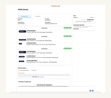
Closer Look At One of The Outdated Upgrade Screens
Business Goals and Developer Constraints - To align on business goals and developer constraints, the team worked closely to understand each project phase and break the work down intentionally. Given the fragile, highly interdependent “house of cards’ experience, we took a methodical approach to untangling and redesigning it.
Exploration
Low-Fi Wireframes - Based on requirements and close collaboration with Product, I started with low‑fidelity wireframes to quickly visualize ideas, align thinking, and spark discussion.
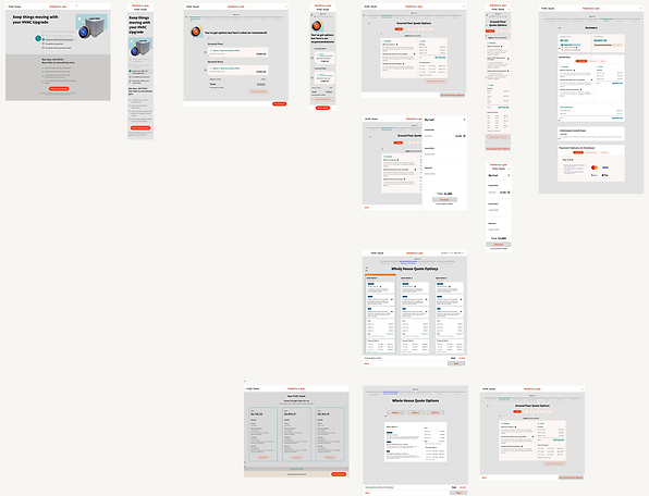
Low-Fi Mocks
Design Inspiration - I utilized Mobbin and explored various experiences to identify consistencies in existing design patterns for entry pages, multi-option pages, review pages, and success pages.

Design Inspiration
Closer Look At One of The Outdated Upgrade Screens
Hi-Fi design ready to test with users - After several rounds of iterations and reviews with stakeholders and developers, we landed on a design that we wanted to test with users.

User Research
I developed an extensive usability test plan and, considering the size of our research team, took full charge of the testing and validation process to ensure our design decisions were informed by direct user feedback.


Prototype
Test Results: Usability testing validated the design direction, achieving a 100% task completion rate and no abandonment. However, feedback highlighted some confusion about the timing of payments.

Testing results
Design Adjustments: Insights showed confusion about Frontdoor's payment process. We made some layout adjustments and clarified the review page with clear text and a “No payment due today” highlight to reduce uncertainty.

Results
The result was a seamless experience on mobile web and desktop with clear, transparent pricing, and financing, fewer surprises and a more confident purchase decision.


Desk Checks
For most projects I typically engage throughout development, collaborating with engineers to assess builds. We identify minor discrepancies between design and implementation, documenting them in Figma. This teamwork enhances quality and improves the end-user experience.

Review of Developed Design With Notes on Revisions
Next Steps
This design creates a solid foundation, moving away from the legacy experience for ongoing improvements. We've aligned on a "Big Sky" vision and started enhancing key areas like upgrade options and the lead form.
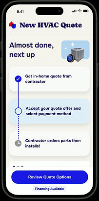
Big Sky Rebranded Future-State
Additionally, we're enhancing the HVAC lead form to provide a clearer success message with specific next steps after submissions.

Lead Form Updates
UPDATE: We launched the enhanced Form at the end of June, resulting in an already notable increases in daily lead submissions.
