

Taktile Dashboard
TYPE:
Team project
Group of 4
MY ROLE:
User Research
Usability Testing
Competitive Analysis
Wireframing
Hi-Fi Mock Ups
Prototyping
TOOLS:
Sketch
Invision
Pen and Paper
DURATION:
3 week design sprint
BACKGROUND
ABOUTTAKTILE
Taktile is a Boston based startup that uses retrofit sensors to help labor-intensive manufacturers measure and manage their productivity. Taktile technology is able to integrate without transforming their current digital platforms.
They are developing software to clearly display data in a dashboard format with additional analysis and management capabilities to help clients quickly make proactive management decisions.
CHALLENGE
Taktile's previous dashboard only displayed basic information.
We needed to provide our users quick access to pertinent information. With access to this information it would improve factory operations.
SOLUTION
Our solution was to design an intuitive and powerful dashboard to help users make informed decisions about their operations.

Final prototype of the 3 user flows.
RESEARCH PHASE
User Interviews
Competitive Analysis
Data Synthesis
Site Visits
Affinity Mapping
Usability Testing
SWOT Analysis
1. An initial issue we faced during our research phase was we only had 3 weeks and a large gap in our knowledge of the complex manufacturing industry. This made every step of our research process essential.
2. Our client came to us with a substantial amount of research already done. Each team member split up the research, synthesized, and came back together to affinity map.
3. After finding some key pain points, wants and needs of the users we validated our clients research by doing our own research process outlined on the left.
4. We conducted 6 phone interviews and visited 2 factories to see their process and while there ran some usability testing on a rough low-fi prototype on our users.
Affinity Mapping
We synthesized our results to identify themes from our users. We grouped common insights together and assigned "I" statements to each theme.

Affinity mapping our gathered data.
Some "I" statements and themes that emerged were:
-
"I need a way to access data more efficiently"
-
"I'm noticing a lot of inefficiencies in our current processes"
-
"I need a way to give/get data"
-
"I need specific metrics"
-
"I need to convert to digital"
Competitive Analysis
During the research phase I facilitated a visual competitive analysis. I printed out relevant visuals from competitors current software solutions. As a group we analyzed what worked and which elements and features we thought our product could improve upon.

Visual competitive analysis.
Primary Persona

Goals:
Wants and Needs:
Pain Points:
The supervisor is constantly monitoring the status of the floor operations. If there is an error or issue in production, he needs to identify and fix it quickly in order to keep operations running smoothly.
The Supervisor
-
Constantly aware of production status.
-
Identify and fix issues with machinery or operators quickly.
-
Oversees operations on the factory floor and keep them on track
-
Train and monitor staff to make sure they are properly performing tasks at the appropriate skill level
-
Quickly detecting and/or preventing issues so they don't cost the company time and money
Site Visits
It was important to broaden our understanding by visiting some factories Taktile is working with. We interviewed users and conducted usability testing on a low-fi prototype. These site visits helped us get a better understanding of our users process, pain points, and needs.
TAKEAWAYS:
-
Technology is outdated and difficult to integrate.
-
Stuck on whiteboards.
-
Want to identify errors/issues in production as quickly as possible.
-
Have a few top metrics that they want to access all the time.

Group site vite to Zoll.
Site Map

User Flows
Data Dive
Setting Alert
Adding a Module

DESIGN PHASE
Design Studio
We began the design phase with a design studio to brainstorm possible layouts for our wireframes. We merged the elements and layout that we found worked the best and came up with a more finalized sketch.
The group was in agreement on the basic layout of the home page dashboard. Another winning element that drove our design was the idea to make the dashboard customizable.
This would bridge the gap that Taktile was facing having to handle multiple industries with varying needs and wants.

Design studio paper prototypes.
Designing for the User
Our group was balancing understanding the complex information our users needed displayed while also designing the UI. We worked to understand the details of for example, the specific metrics a donut chart would need to display, then myself and another group member would start working on mid to high fidelity wireframes.
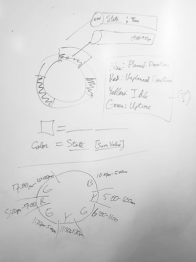

Hi-fi prototype of the donut chart.
Sketching out the details of the donut chart.
Usability Testing
Through some usability testing, iterations were made. Most of our pages and flows were easy and understandable to our users. However, there were some consistency and learnability issues that arose during testing that we address.
Iterations
1 + 2. "Critical" and "warning" names and symbols were merged. The position of the symbol was disorienting.
3. "Enter" and "delete" button sizes and alignment changed.
4. Carrot position was adjusted.
5. To reinforce and guide the user to which page they were on we added a highlight to "threshold."
6. Change color to keep with consistency.


For this specific iteration we were testing the flow of adding a modular to your dashboard. We found our users wanted the subcategories displayed next to the main category so they didn't have to search hard for the specific metrics they wanted to add.


NEXT STEPS
Taktile was ecstatic with our final deliverable. Going forward we would need to continue building out the other pages in the main navigation. We also wanted to build out more robust features like adding a toggle capability between supervisor, manager, or operator. We also wanted to make a dark mode option, and we want to conduct more in depth usability testing.